Banks that hope to compete in today’s market must put the consumer first. In the current market, that means focusing on digital channels. As more and more consumers prefer to bank online, via a tablet, desktop or mobile phone, banks must find a way to offer the best digital experience possible. Often, one of the first steps in creating digital channels that live up to consumer expectations is to take a look at your bank’s overall website design and functionality. While a website build is no small project, standard best practices suggest that you should consider a refresh of your website design every three or four years. To help get you started on ideas, the team at Engageware has put together a list of our top picks for the best bank website designs. We work with over 350 banking customers to help them improve the digital experience for consumers by using our innovative, game-changing Customer Self-Service and Appointment Scheduling software, we have seen a lot of websites — the good, the bad, and everything in between! Hopefully, the list below will serve as inspiration for you as you embark on your next website design project.
Our Top Picks for the Best Bank and Credit Union Website Designs
Heritage Grove FCU
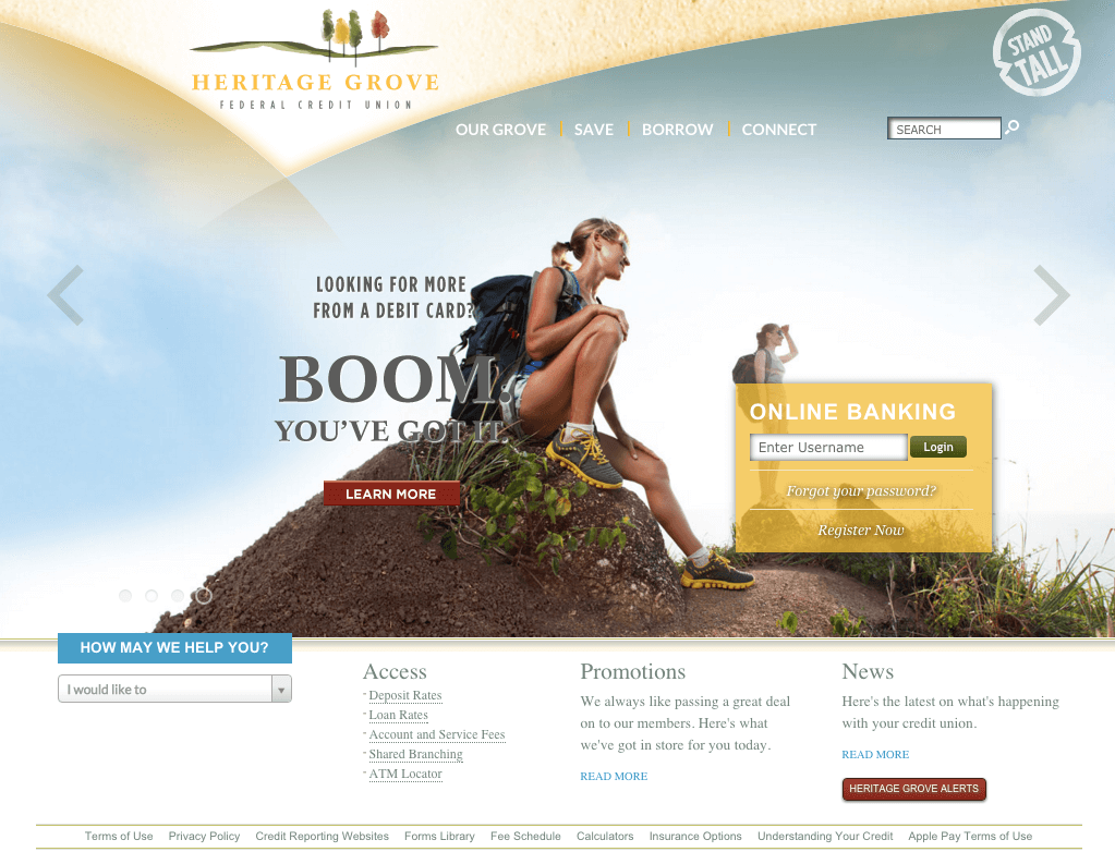
Heritage Grove Federal Credit Union’s responsive website design relies on a serene palette of calming, natural colors to evoke a down to earth, simple and warm feel for visitors. Its quiet elegance makes you forget for a second that you are actually on a credit union’s website — there are no pushy sales pitches, bold call-outs or busy sidebars. The navigation is simple and straightforward yet packs a punch with the amount of choices in the drop-down menus. Overall, this is an extremely intuitive, user-friendly site with a beautiful and businesslike design that acts as a trusted resource for members and prospective members.
“We redesigned our website with the assistance of a marketing agency while rebranding our credit union. We sought to communicate our brand image via a clean design with a lot of white space and an intentional absence of clutter. We located our online banking login box prominently on every page, understanding that accessing internet banking is our members’ top reason for visiting the site. We have been very happy with the results and feel that our website design played a positive role in our brand transition.”
– Jim Mau, President/CEO, Heritage Grove Federal Credit Union
People’s United Bank
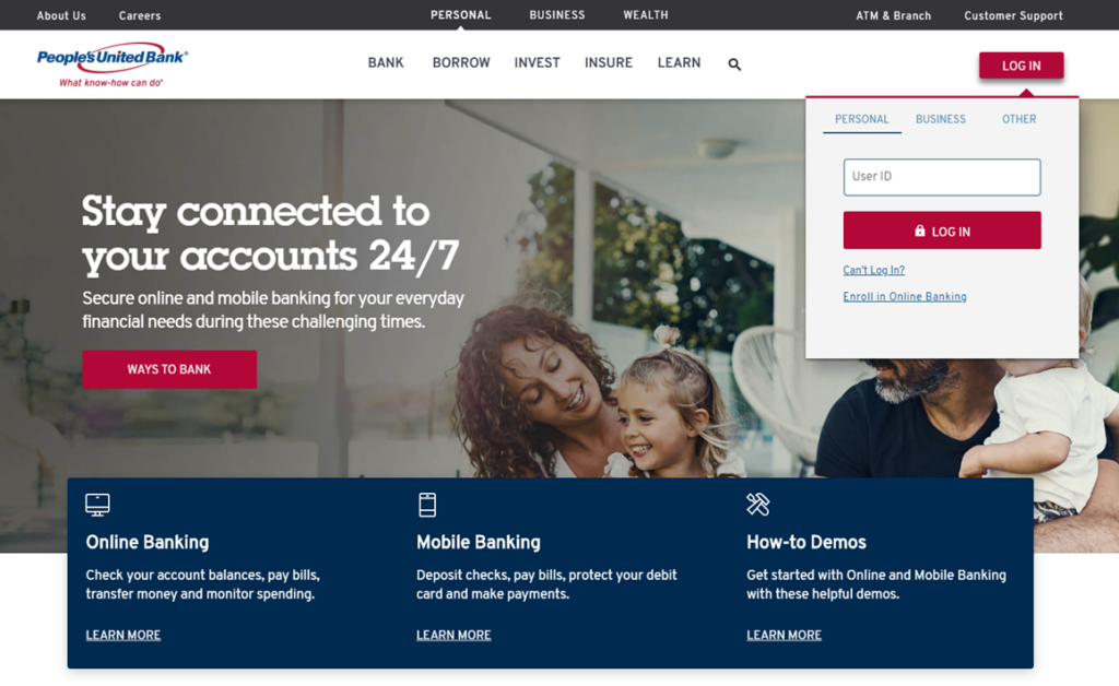
People’s United Bank’s web design goes light on the text, favoring CTAs (calls to action) and “at-a-glance” type info to attract customers without overwhelming them. The website leverages their brand colors to attract attention to certain areas. Most of the website feels simple and clean with a white background while some information is highlighted with a blue background and some of the CTAs are red to stand out.
Simple
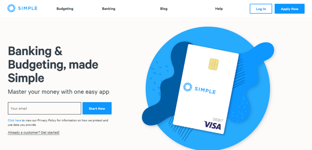
Simple’s website follows its mantra, with a simple and clean scrolling design. The homepage has one central focus that pulls the users attention immediately to their start now CTA on the left. The navigation has only 4 simple choices; product features are explained with brief bullets and imagery, and the “Apply Now” CTA is placed non-intrusively at both the top and bottom of pages. With the mobile experience being a main feature of the Simple product, they deliver with a responsive design that gets straight to the point.
PNC Virtual Wallet
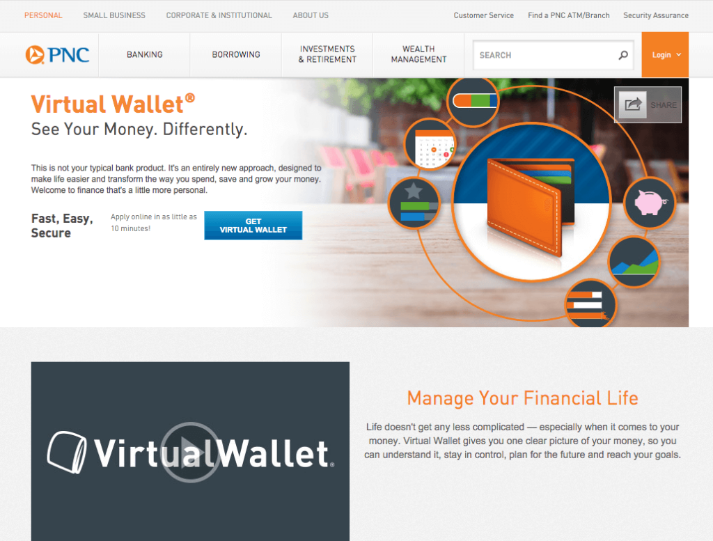
PNC is clearly targeting the younger, college-age set. Their heavy use of imagery and video clearly reflect this along with their bold and collegiate-like color choices of orange and blue. Almost every page on the PNC site includes a video along with illustrated graphics that help explain a concept without using text. The site is busy and bright without being distracting, reflecting the younger generation’s multi-tasking mindset. This is definitely not your average banking site and is a great example of how banks can use a variety of media and imagery to target a specific group and sell a product.
Northeast Credit Union
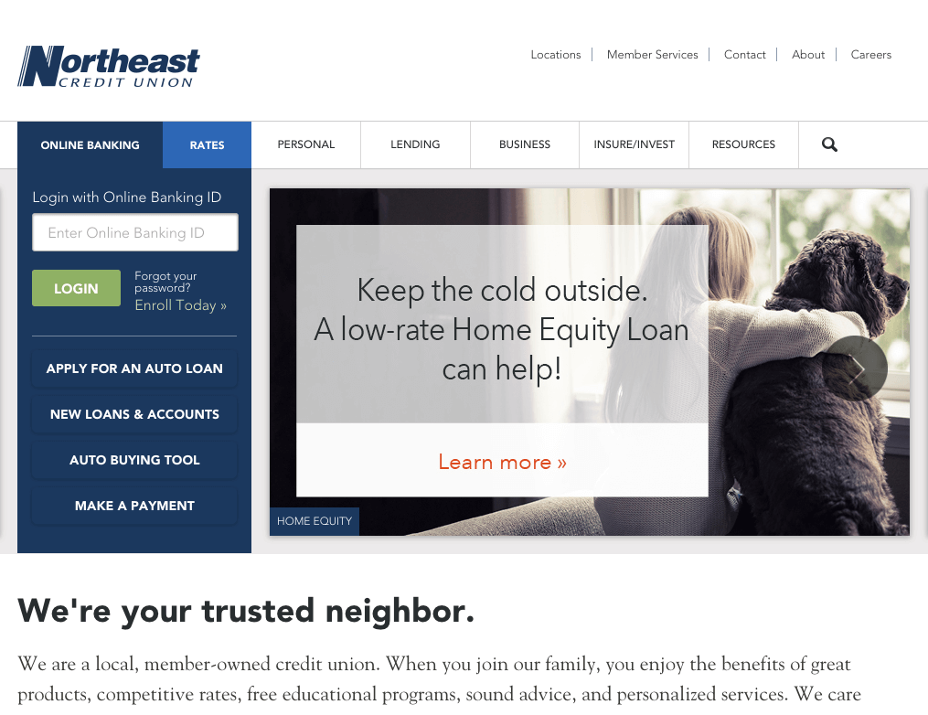
Northeast Credit Union brings it back to the basics with their Diamond Award winning and extremely clean, blue and white website design. They don’t put too much text on the page but instead make use of white space to draw the user’s eye to the right places. Offering up related articles on each page helps to educate the user and give additional, relevant information to move the visitor along the buying cycle.
“Our [new] site (after a 2011 redesign) is intuitive, uncluttered, and has options for effective messaging, while at the same time, making it easier for members to access features important to them right from the home page, features such as: Login to Online Banking, Checking Rates, Making a Payment, or Opening an Account.”
– Northeast Credit Union
Star Financial
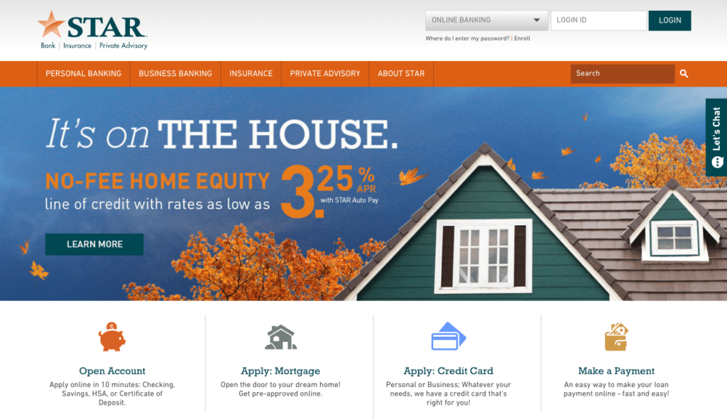
Star Financial makes it easy for the user to take action immediately, with a responsive website design and four actionable call outs on the home page: Open Account; Apply: Mortgage; Apply: Credit Card and Make a Payment. Using color and subheads to break up text on secondary pages, Star Financial makes scanning pages for relevant information a snap.
Johnson Bank
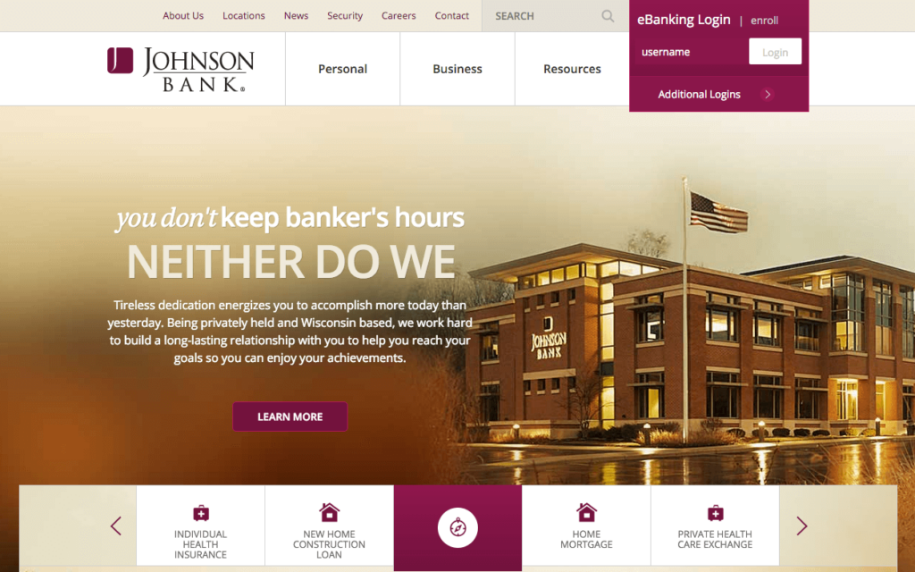
Johnson Bank employs an extremely clean and intuitive website design with warm shades of gold, maroon, and white. The e-Banking login box is prominent in the navigation, sitting alongside the search bar. There is also a simple, four-field “Find an Advisor” form that appears below the e-Banking login as soon as a user clicks on one of the three main navigation buttons. Overall, Johnson Bank is right on the mark when it comes to usability and understanding their customers’ needs, wants and website navigation behavior, while at the same time displaying a beautiful bank website that is easy on the eyes, with the perfect mix of content, images, and tools.
BECU
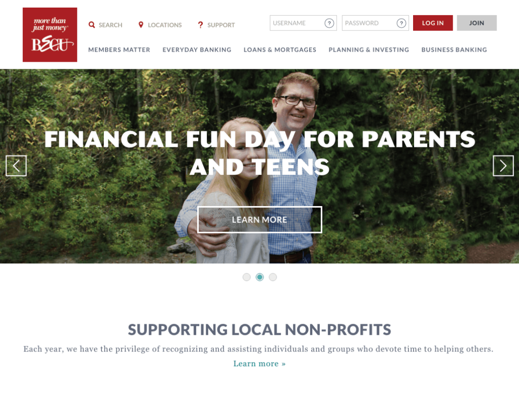
BECU uses a large, bold font and relatable imagery of what appear to be real members. The site does a great job of conveying the “member first” message and portraying themselves as a credit union by and for the community.
Georgia’s Own Credit Union
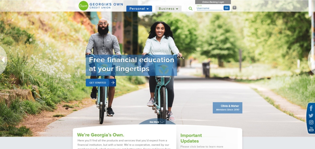
Georgia’s own uses a modular content design to deliver a bold, modern, eye-catching website design. The use of actual members in their pictures makes their institution seem friendly and member focused especially highlighting those that have been members for over 10 years. With a compact navigation bar they put the user’s focus on their clear messages and rotating CTAs.
Umpqua Bank
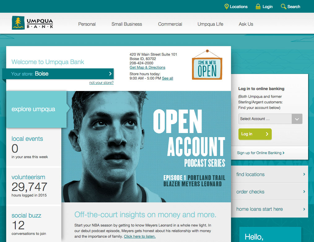
Umpqua Bank uses a simple, sleek design that targets one specific message. At the moment that message is focused around home mortgages, in an effort to entice buyers during the prime spring shopping season, to consider a home loan through Umpqua. Their banking services almost feel like an afterthought, only taking up space in the navigation and sidebar of the home page. Imagery is all-illustrative with tonal colors.
Huntington
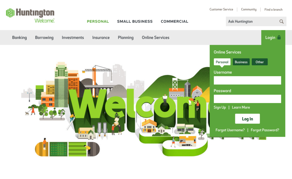
Huntington Bank uses large 3D font, bold and bright colors, prominent CTAs and illustrative imagery to make their pages scannable. These features also help the site pages perform their main mission — to act as a gateway for the heartier information, which is primarily located on landing pages.
“A few of the strategies we kept in mind when redesigning the website: welcome every visitor whether new or returning with tailored messages; include a responsive web design so customers can interact with us as they choose, no matter the device; and offer an improved and simplified design driven by our understanding of how our consumers want to interact with the site. Huntington.com illustrates our commitment to developing innovative products and services that enhance the customer experience, making it seamless across digital and branch channels.”
– Mark Sheehan, Payments and Channels Director, Huntington Bank
TCF Bank
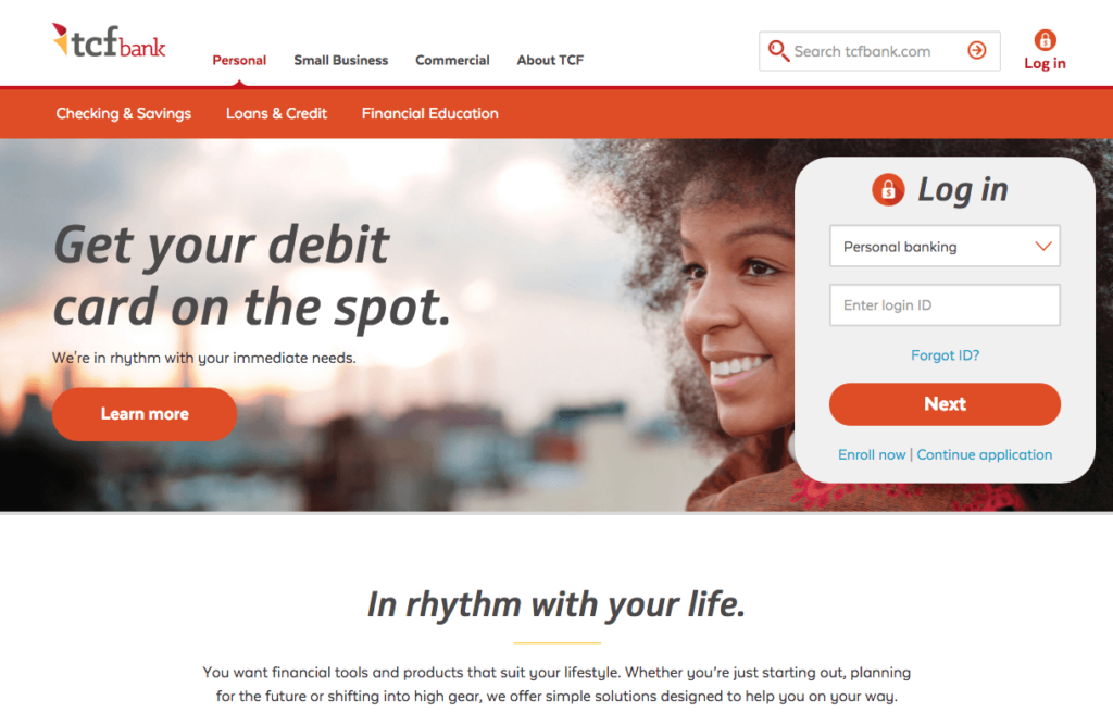
TCF simply and beautifully sections off many of their pages by alternating between gray and white background colors. They use a mix of illustration and photography to give each section life and they use circular frames around photos as well as sidebar images to make each page unique. The navigation is extremely simple so as not to overwhelm visitors and text is kept to a minimum or displayed in a way that makes scanning easy for the user.
Gateway Bank
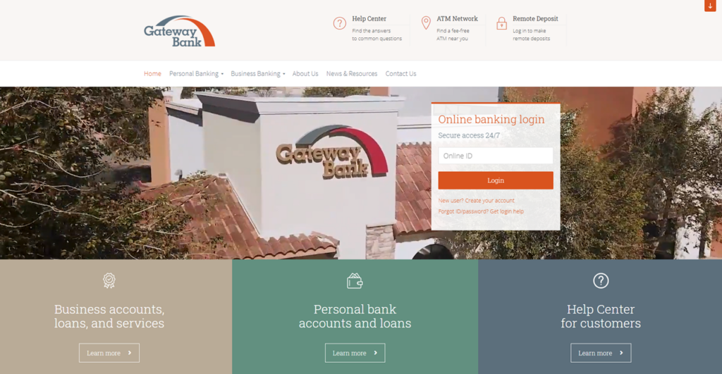
Gateway Bank uses simplicity and large text filled buttons with scroll over functionality to help users quickly and easily find what they are looking for. Unlike many others, they included a large call out button for their Help Center immediately directing customers to where they can get the answers to their questions. Consistency is the key to this asset manager’s flawless and intuitive design – the user always knows what they are going to get. And in this case, that’s a good thing.
Service Credit Union
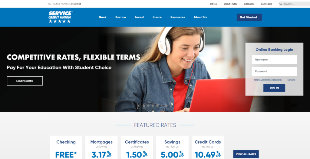
Service Credit Union offers a clean and straightforward website with clear and spread out CTA’s to guide to users in the right direction whether they need to sign up for an account or log into their existing account. Their main image rotates displaying a variety of themes raging from their mobile app, member assistance programs, community impact, student loans, and auto loans. This type of variety is likely to have something that is relevant to almost every website visitor. Also, their simple and clearly labeled navigation bar makes it easy for their members or potential customers to find exactly what their looking for.
Byline Bank
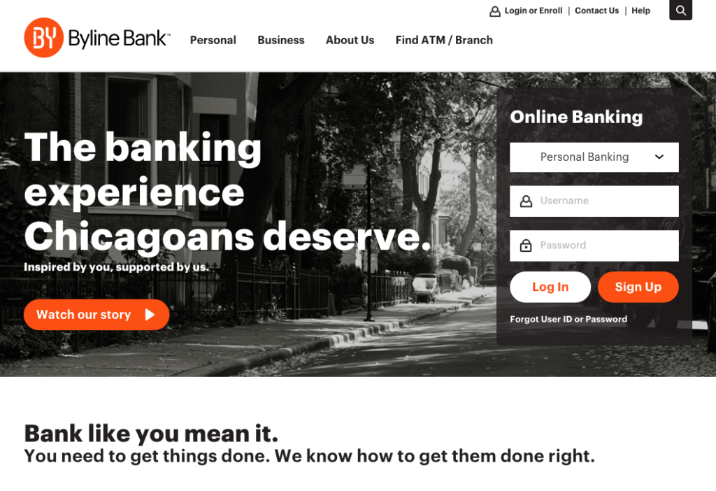
The black and white website design used by Byline Bank creates an old-time yet contemporary feel. With large cityscape images, close-ups and videos — all in black and white, paired with clean black, gray and white font and red CTA buttons — Byline Bank truly feels like a Chicago financial services firm.
City Bank
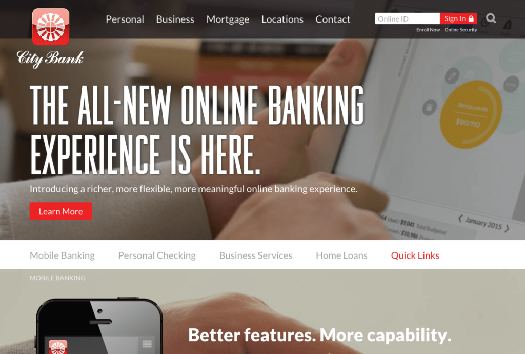
City Bank uses a cinematic layout on the home page that acts as a brief demo of their online banking offering. Their scrolling site uses large background images for each section, overlaid with bold text to promote their featured offerings. Secondary pages are clean and easy to navigate. City Bank has created an overall beautiful site that employs some of the latest trends in responsive web design.
“For us, escaping the online stereotype was relatively easy as a bank or credit union when it came time for a website redesign; the landscape is littered with desktop-first sites that essentially communicate the same thing in the same way. Breaking the mold is something we’ve done before and we wanted our site to reinforce those innovative brand characteristics. With increased SEO, PPC, and online display initiatives, it was crucial to render a more unique, more engaging site for our hard-earned traffic — on top of delivering a renewed experience for our existing customers,”
– Steve Smothers, VP/Marketing Director, City Bank
Northwoods Bank
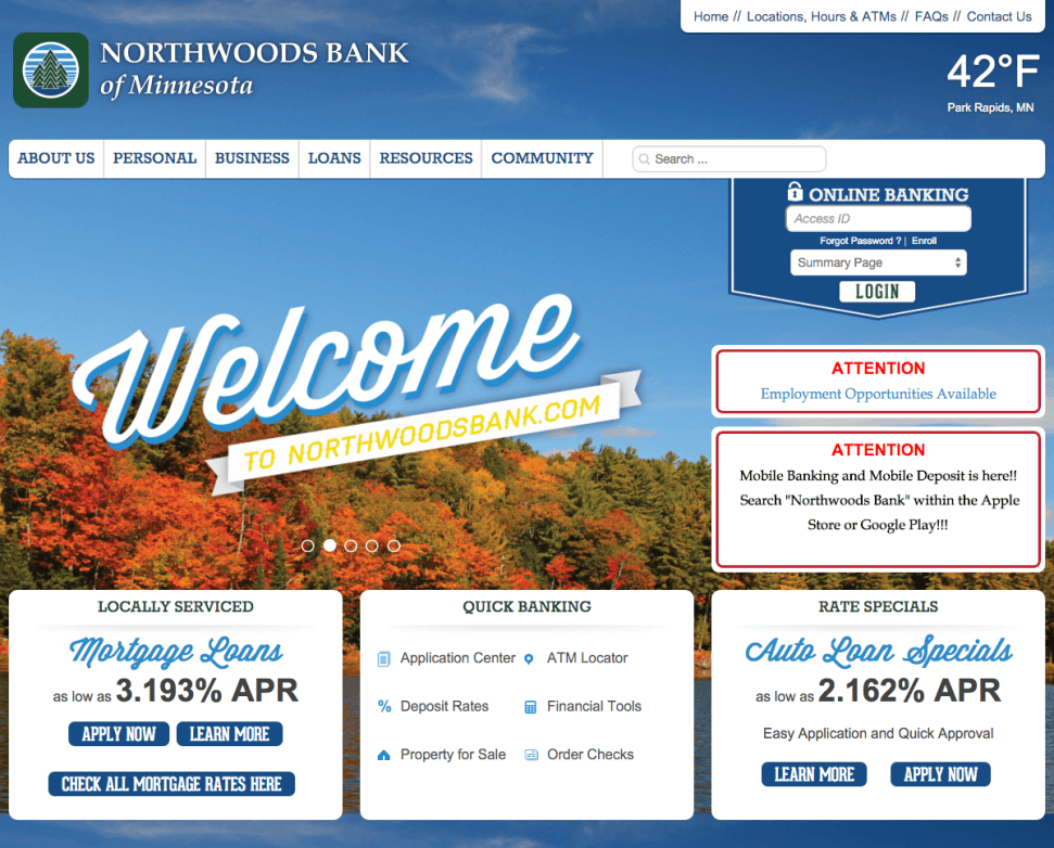
Unique fonts and flat colors give the Northwood’s Bank site a truly woodsy, Minnesota feel. By including pictures of many Northwood’s employees, along with customer testimonials, the bank exudes a real community feel.
Commonwealth Credit Union
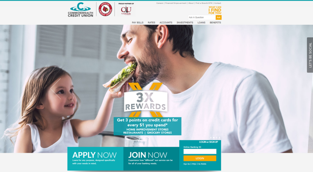
Commonwealth Credit Union uses strong images that give their site a sense of life and excitement. They have a prominent three-button CTA bar on the homepage that includes, “Apply Now,” “Join Now” and the Online Banking login box. In addition, there is a sticky “Let’s Be Social” pop out bar that blends in with the site, while at the same drawing users’ attention. They also offer web visitors the option to self-serve with a prominent search bar in the top right corner with a bright colored call out “What Can I Find For You”.
“As a Credit Union, we truly do look at our members as part of our family and we want to take care of their financial needs. For us, that means not only having better products and services, but also crafting an enhanced user experience on our website. Our goal has been to give members faster access to the things they want and need, to personalize the experience for them, and to help educate them on their finances in general.”
– Andrea Hayes, Marketing Director, Commonwealth Credit Union
Field & Main Bank
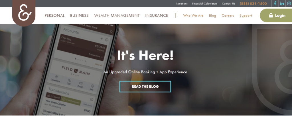
Field & Main Bank’s website has a sleek feel to it with only one main focus when you first enter the website,their mobile banking. Their navigation to emphasizes options they likely want visitors to focus on like Personal, Business, Wealth Management, and insurance while featuring their Blog, Careers, Support and other information in smaller and less bold text. The site is simple and easy to navigate with a vintage, hometown feel.
“In developing our website design, as with everything we do at Field & Main Bank, we seek to create a crafted experience. Our goal is provide our clients innovative tools to manage their accounts and finances, and a seamless mobile experience, while maintaining the thoughtful, personal and beautiful touch that’s so important to our brand and our story.”
– Danielle Falconer, Senior VP Marketing & Communications, Field & Main Bank
A truly inspirational website design can go a long way in your bank or credit union’s marketing efforts to convert and retain potential and current customers. At Engageware, we take great bank websites and make them even better with customer engagement solutions including self-service support and appointment scheduling that integrate across mobile, internet and digital banking channels, to provide a consistent and intelligent buying experience for customers. We modify your existing website to give you the most effective and robust web tool for growing loans, revenue and deposits. Learn more about how our Customer Self-Service and Appointment Scheduling can help your bank or credit union deliver the experience your consumers demand across all your digital channels.
Related Resources:
- Top 4 Trends for Improving The Banking Customer Experience
- Providing Digital Support as Banking Customers Shift to Digital
- How To Support Your Banking Customers During the COVID-19 Crisis
- 8 Ways to Improve Your Bank or Credit Union’s Customer Service
- Staley Credit Union Delivers Digital Support to Members’ Fingertips in Less than 30 Days